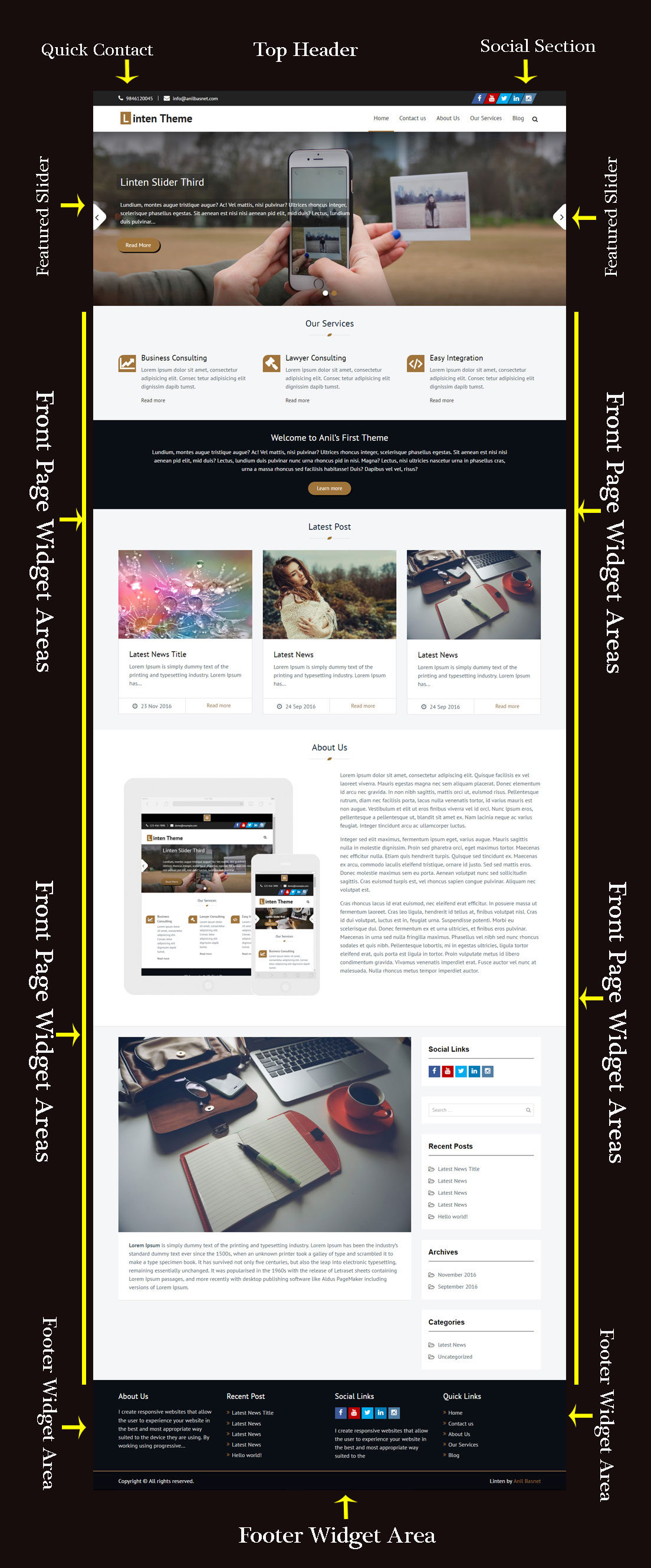
Linten: My First Free WordPress Theme

Linten is a very modern and interactive business WordPress theme, with attractive sections and features. It comes with stunning image slider, featured services and more others. It can be used for any kind of businesses or corporate websites. The design is professional, yet very friendly. It is easy to use and customize, enticing, mobile friendly and technologically seamless and fluid.

 linten


SVG Introduction

SVG is short for Scalable Vector Graphics. It is a graphic format in which the shapes are specified in XML. The XML is then rendered by an SVG viewer. Today most web browser can display SVG just like they can display PNG, GIF, and JPG.

Internet Explorer 8 (and earlier) users may have to install the Adobe SVG Viewer to be able to view SVG in the browser. IE 9+, Chrome and Firefox all support SVG natively.

SVG is for 2-dimensional vector graphics. For a 3-dimensional format lookup X3D.

If you are not sure if SVG is right for you or your project, take a quick look at the SVG Examples page to get a quick overview at the capabilities of SVG.

CSS Properties

Similar to selectors, properties that are too specific will hinder the flexibility of the design. Less is more. Make sure you are not repeating styling or introducing fixed dimensions (when a fluid solution is more acceptable).

  • Properties should be followed by a colon and a space.
  • All properties and values should be lowercase, except for font names and vendor-specific properties.
  • Use hex code for colors, or rgba() if opacity is needed. Avoid RGB format and uppercase, and shorten values when possible: #fff instead of #FFFFFF.
  • Use shorthand (except when overriding styles) for background, border, font, list-style, margin, and padding values as much as possible. (For a shorthand reference, see CSS Shorthand.)

Property Ordering #

“Group like properties together, especially if you have a lot of them.”
— Nacin

Above all else, choose something that is meaningful to you and semantic in some way. Random ordering is chaos, not poetry. In WordPress Core, our choice is logical or grouped ordering, wherein properties are grouped by meaning and ordered specifically within those groups. The properties within groups are also strategically ordered to create transitions between sections, such as background directly before color. The baseline for ordering is:

  • Display
  • Positioning
  • Box model
  • Colors and Typography
  • Other

Things that are not yet used in core itself, such as CSS3 animations, may not have a prescribed place above but likely would fit into one of the above in a logical manner. Just as CSS is evolving, so our standards will evolve with it.

Top/Right/Bottom/Left (TRBL/trouble) should be the order for any relevant properties (e.g. margin), much as the order goes in values. Corner specifiers (e.g. border-radius-*-*) should be top-left, top-right, bottom-right, bottom-left. This is derived from how shorthand values would be ordered.

Example:

1
2
3
4
5
6
7
#overlay {
    position: absolute;
    z-index: 1;
    padding: 10px;
    background: #fff;
    color: #777;
}

Another method that is often used, including by the Automattic/WordPress.com Themes Team, is to order properties alphabetically, with or without certain exceptions.

Example:

1
2
3
4
5
6
7
#overlay {
    background: #fff;
    color: #777;
    padding: 10px;
    position: absolute;
    z-index: 1;
}

Posted in CSS

CSS Selectors 

With specificity, comes great responsibility. Broad selectors allow us to be efficient, yet can have adverse consequences if not tested. Location-specific selectors can save us time, but will quickly lead to a cluttered stylesheet. Exercise your best judgement to create selectors that find the right balance between contributing to the overall style and layout of the DOM.

  • Similar to the WordPress Coding Standards for file names, use lowercase and separate words with hyphens when naming selectors. Avoid camelcase and underscores.
  • Use human readable selectors that describe what element(s) they style.
  • Attribute selectors should use double quotes around values
  • Refrain from using over-qualified selectors, div.container can simply be stated as .container

Correct:

1
2
3
4
5
6
7
#comment-form {
    margin: 1em 0;
}
input[type="text"] {
    line-height: 1.1;
}

Incorrect:

1
2
3
4
5
6
7
8
9
10
11
12
13
14
15
16
17
18
19
#commentForm { /* Avoid camelcase. */
    margin: 0;
}
#comment_form { /* Avoid underscores. */
    margin: 0;
}
div#comment_form { /* Avoid over-qualification. */
    margin: 0;
}
#c1-xr { /* What is a c1-xr?! Use a better name. */
    margin: 0;
}
input[type=text] { /* Should be [type="text"] */
    line-height: 110% /* Also doubly incorrect */
}
Posted in CSS

CSS Structure

Like any coding standard, the purpose of the WordPress CSS Coding Standards is to create a baseline for collaboration and review within various aspects of the WordPress open source project and community, from core code to themes to plugins. Files within a project should appear as though created by a single entity. Above all else, create code that is readable, meaningful, consistent, and beautiful.

Within core stylesheets, inconsistencies will often be found. We are working on addressing these and make every effort to have patches and commits from this point forward follow the CSS coding standards. More information on the above and contributing to UI/front-end development will be forthcoming in a separate set of guidelines.

Structure #

There are plenty of different methods for structuring a stylesheet. With the CSS in core, it is important to retain a high degree of legibility. This enables subsequent contributors to have a clear understanding of the flow of the document.

  • Use tabs, not spaces, to indent each property.
  • Add two blank lines between sections and one blank line between blocks in a section.
  • Each selector should be on its own line, ending in either a comma or an opening curly brace. Property-value pairs should be on their own line, with one tab of indentation and an ending semicolon. The closing brace should be flush left, using the same level of indentation as the opening selector.

Correct:

1
2
3
4
5
6
#selector-1,
#selector-2,
#selector-3 {
    background: #fff;
    color: #000;
}

Incorrect:

1
2
3
4
5
6
#selector-1, #selector-2, #selector-3 {
    background: #fff;
    color: #000;
    }
#selector-1 { background: #fff; color: #000; }
Posted in CSS

Animating from “display: block” to “display: none”

As you might already know, CSS3 transitions and animations allow you to animate a specific set of CSS properties. One of the properties that cannot be animated is the display property.

It would be great if we could do it, but it’s not currently possible and I’m guessing it never will be (e.g. how would you animate to “display: table”?). But there are ways to work around it, and I’ll present one way here.

Why the Need to Animate “display”?

The need to animate the display property comes from wanting to solve the following problem:

  • You want to make an element gradually disappear visually from the page.
  • You don’t want that element to take up space after it has disappeared (i.e., you want the disappearance to cause reflow).
  • You want to use CSS for the animation, not a library.

For this reason, animating opacity to zero is simply not enough because an element with zero opacity still occupies the same space on the page.

Let’s look at how we might attempt to solve this problem, step by step.